7QC Tools — Scatter Diagram
Scatter Diagram Analysis Uncover Variable RelationshipsThat Drive Quality
Why Root Causes Often Remain Hidden
Multiple process variables interacting unpredictably
Root causes remain hidden in complex data sets
Conflicting interpretations of production data
Hidden dependencies between process parameters
Slow troubleshooting due to unclear variable relationships
The Concept
How Scatter Diagrams Reveal Variable Relationships
Visualise relationships between any two measurable variables
Validate cause-and-effect hypotheses with real data
Distinguish correlation types to guide action
Support root cause analysis and process optimization

Our Approach
Scatter Diagram Analysis Framework
A structured 5-step process from variable selection to process insight.
01
Variable Identification
Select the process variables to analyse for potential relationships.
02
Data Collection
Collect paired data systematically across production runs.
03
Scatter Diagram Development
Plot data points to visualise variable relationships.
04
Correlation Interpretation
Analyse patterns to determine correlation type and strength.
05
Process Insight & Improvement
Translate findings into targeted process improvements.
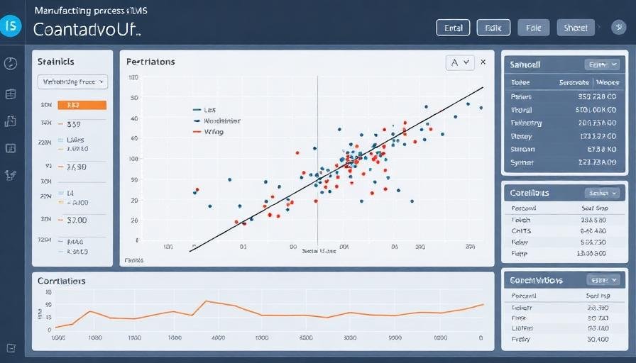
Common Correlation Patterns
Understanding what scatter diagram shapes tell you about process behaviour.
Positive Correlation
Both variables increase together — indicates a direct relationship between process parameters.
Negative Correlation
One variable increases as the other decreases — reveals inverse dependencies.
No Correlation
No visible pattern — suggests the variables are independent of each other.
Non-linear Relationship
A curved pattern — indicates a complex relationship requiring deeper analysis.
Business Impact
Measurable Results
Root Cause Speed
faster identification
Process Clarity
better variable understanding
Data-Driven Decisions
improvement in accuracy
Troubleshooting Time
reduction achieved
Integrated Approach
Scatter Diagrams Within Quality Systems
Pareto Analysis
Prioritise which variable relationships to investigate first.
Histogram
Understand individual variable distributions before correlation analysis.
Control Charts
Monitor variables identified as critical through scatter analysis.
Cause & Effect Diagram
Map potential causes before validating with scatter data.
Six Sigma
Use scatter analysis within DMAIC Analyse phase for root cause validation.
Engagement Models
How We Engage
Data Analysis Assessment
Review your process data to identify key variable relationships for investigation.
Scatter Diagram Development
We build and interpret scatter diagrams using your real production data.
Correlation Interpretation
Expert interpretation of patterns to identify actionable process insights.
Process Improvement Insights
Translate scatter analysis findings into targeted improvement actions.
Industries Using Scatter Diagram Analysis
Applicable wherever process variables need to be understood and optimised.
Manufacturing
Automotive
Engineering
Electronics
Process Industries
FAQs